Sunday, 3 April 2011

Audience Feedback

Overall the feedback we received was very positive and many groups agreed with the decisions we had made.
Many of the positive comments referred to the music with one group saying: The non-diegetic music was a good choice and the way it stops when she falls and hits the ground is very effective!’. As a group we decided to cut the music when Nina falls to indicate to the audience that this happy and upbeat atmosphere created by the music had been disrupted by the bully. One comment read: music clear and matches the opening’ we felt that the song fitted in with the music used in other teen romantic comedies and the lyrics helped to portray some of the traits associated with teenagers.
We wanted to make sure that the different stereotypes could be clearly identified by the audience in the opening. One group said: ‘Good use of stereotypes’. This was something that we felt was very important to include in the opening as from our research we found that these were the conventional stereotypes seen in teen romantic comedies, so we used props and costume to portray this, with another group saying: ‘The iconography is excellent throughout the opening; such as the lip gloss for the popular girl and the big glasses for the geeky girl, which are common things people associate with these characters.’.
A positive piece of feedback we received was about the characters getting ready ‘close ups of characters getting ready introduces characters well’, this is something that as a group we felt was important, as this allowed the stereotypes associated with each character be identified, such as the jock wearing a varsity jacket. This also allowed us to clearly show Nina as the main character, as she is the first face you see.
An improvement we received was ‘The only thing that our group would change would be the colours and the clothes of the popular girl. The fact she is blonde helps but it would of been more stereotypical if she was wearing pinks and bright colours.’ This was something that we tried to incorporate in our original character profiles (a pink top/skirt with a black top/skirt), however when we began filming it wasn’t possible, so we had to resort to the darker costume used. However, if we were to do this task again, we would have used what we had original planned the Bitch to wear, as pink is more stereotypically associated with this stereotype.
One group said: ‘A range of accurate camera shots and camera movements have been used which has helped to portray the genre, such as the tilt up the jock character.’ This was something that we found tricky to smoothly do at first, but the use of a tri-pod helped us succeed in producing steady shots in our opening. By doing this, it helped us create verisimilitude and continuity throughout the piece, a group agreed with this by saying: ‘continuity is good’.
A negative comment that we received was ‘background noises change; disrupts the continuity’ this was something that I agreed with, as when we were filming, we tried to only film when the corridors were silent, however there were people cleaning and clubs happening afterschool so in some shots there is slight background noise. If we were to do this task again, we would have found a corridor that wasn’t in as much use as the one we used in our opening, which may have helped to get rid of unwanted background sounds.
The comments referring to the use of titles were on the whole very positive: ‘We like the titles used and the way the title of the film stands out from the rest and it is also looks like an already made teen romance.’ The idea of making the title of the film stand out from the rest of the titles was something that we thought was important, as the name of our film is clearly associated with teen romantic comedies. However, a negative comment we received about the titles we used was: ‘actors names are on screen for different lengths of times’ this is something that we noticed when editing our opening, however, I don’t feel that this is a massive fault, as this was a hard thing to overcome with the clips all being different lengths of time.

Wednesday, 30 March 2011

Evaluation Script


Use, develop or challenge forms and conventions of real media products:
As a group we focused on using and developing the forms and conventions of our chosen genre, teen romantic comedy.
From our research we discovered that the two main stock settings of a teen romantic comedy were a high school (10 Things I Hate About You CLIP) along with the main character’s houses or bedrooms. As a result of this, the main setting we used was a high school, as school is a significant part of teenage life. We also decided to use the bedrooms of the four main characters – the Geek, the Jock, the Bitch and the Loner – as this helped us portray to the audience the stereotypes associated with youth, such as the Geek putting on glasses. (CLIP)
Throughout our research we discovered that the stock characters seen in a teen romantic comedy are a Geek, Jock, Bitch, Rebel, Rich Girl and Cheerleader. As this was apparent we asked in our questionnaire: ‘Tick the characters which you would expect to see in a teen romantic comedy’. (CHART) The results showed that Geek, Jock and Bitch were the most common responses; therefore we decided to include these character stereotypes in our opening. Although the Cheerleader and Rich Girl had a higher percentage in comparison to the Rebel, we felt that they were more of an American stereotype; consequently we decided not to include these stereotypes in our opening. As a group we decided to include a Loner stereotypical character instead of a Rebel, as we felt this was more of a British stereotype seen in teen romantic comedies.
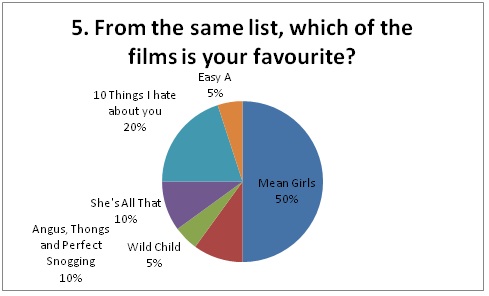
We found from our research that linear narratives are stereotypical to teen romantic comedies, with a clear beginning, middle and end. We have included this style of narrative in our opening. From our research, we also discovered that the majority of teen romantic comedies follow Todorov’s theory and features many frequent disruptions, examples of this are Mean Girls and Angus, Thongs and Perfect Snogging. A film from our research that didn’t follow this theory is Easy A, however, we chose to follow the theory in our synopsis. (SYNOPSIS)
Our research showed that the iconographies of a teen romantic comedy are a high school, uniform, expensive cars and big houses. We felt that expensive cars and big houses are more dominantly used in American teen romantic comedies. As a result of this we decided to focus more on the use of a high school, as this focuses on the idea that education is a large part of teen life.
The research of our chosen genre showed that modern fonts, such as block and handwritten styles, are frequently used throughout the openings. Bright colours such as orange, blue, green and pink are also consistently used in the titles of the films. As a group, we chose the name Geek Chic for our opening, as this portrayed the two contrasting stereotypes of Geek and Bitch. Due to this decision we decided to use contrasting colours of pink and black to distinguish the main stereotypes used in our opening. However, we chose to use white for the actor’s first name and pink for the actor’s last name, as this allowed the text to be seen clearly on screen. (PICTURE OF ANNA/GEEK CHIC) In our questionnaire we asked a variety of questions regarding the use of titles and where the audience expected to see them on screen. (PICTURE) Although the majority of the people asked expected to see the titles in the centre of the screen, we chose to only have the title of the film here as we felt that we needed to make this the main focus point.  We decided to place the actor’s names at the bottom centre of the screen as we felt that this didn’t distract the viewers from the action. Even though we changed the positioning of the titles here, we felt that it was more effective, yet highlighted that these titles are less significant than the main title.
The main themes we identified from our research were relationships, family and fitting in at school. We have included the theme of relationships, which is shown through the identification of the Jock and Bitch’s romantic relationship. We felt this was an important theme to include in our opening, as this is a stereotypical type of relationship associated with youth. As a group we decided that family wasn’t as an important theme as relationships and fitting in at school, so we didn’t include this theme in our opening. Our main character, Nina, is new at school, which immediately highlights that a major theme in our opening is fitting in and our use of stereotypes aids this.

Representing Particular Social Groups:
The social group that we focused on was youth. We showed this particular social group through the use of mise en scene. As we have already acknowledged, the stock setting we have used in our opening is a high school, as this is a major part of teenage life.
Through our use of costume we were able to portray the stereotypes associated with teen romantic comedies to the audience. For example, the Geek wore jeans and a plain top, showing that she didn’t stand out from the crowd. She also wore glasses, which is continually used to show a Geek stereotype. Another example of the use of costume in our work was to portray the stereotype of a Jock. We chose to use a varsity jacket to represent the athletic trait associated with the Jock stereotype. (CLIP OF JOCK) We also decided to show the Jock putting on a t-shirt, showing his body. This reinforced the stereotype that Jock’s have muscular bodies.
As a group we came to the conclusion that the Geek should have closed body language – such as not making eye-contact when talking to people and should fidget with her books – showing that she was insecure and not used to being noticed. In contrast, the Bitch had sharp movements, often standing with her hand on her hip, showing that she was confident and impatient.

Media Institution and Why:
The media institution that we have chosen to distribute our media product is Paramount Pictures. We have chosen this institution because they are considered one of the top-grossing movie studios. Another factor that affected our decision was that Paramount Pictures are a suitable company due to producing many successful films of our genre. Some examples of successful teen romantic comedies that have been distributed by the company are Clueless (1995), Pretty in Pink (1986), Mean Girls (2004) and Angus, Thongs and Perfect Snogging (2008). All of these films are well known and since the institution has a good reputation within the industry, our media product will have a good chance of having success. By choosing Paramount Pictures, it means that the majority of the money will go to one company, meaning that they will gain more profit, allowing us to do the same, as they are a vertically integrated organisation.

Audience:
Our target audience is females between the ages of 12-16, fitting in with the average certificate for a teen romantic comedy, 12A. (QUESTIONNAIRE) In our questionnaire we asked the audience: ‘In the opening of a teen romantic comedy, would you expect music?’ (IMAGE OF QUESTION) The results showed that each person expected music in the opening of a teen romantic comedy, therefore this helped in our choices of how to create an enigma in an opening, as from our research we discovered that music is often used to do this.
The results of our questionnaire also revealed that an almost equal number of people expected a voiceover in the opening of a teen romantic comedy, compared to those who didn’t. Even though voiceovers are often used in teen romantic comedies, we chose to challenge this convention, as we felt that this would take away from the enigma created by the music.
To allow our opening to captivate our audience’s interest, we decided against showing the faces of the characters as they are first introduced on screen. This created an intriguing atmosphere for our audience, as they can only relate to the characters through their stereotypical props and costume. The first face that the audience see on screen is Nina, identifying her to the audience as the main character. (CLIP)

Technologies:
We used the internet in order to do numerous things - such as researching about our chosen genre and films associated with it, storing information on our Blogger accounts and using YouTube to find music and upload our final pieces of work. By using the internet, it has helped us greatly in the process of constructing our media product, such as allowing us to access media quickly and on a wide basis.
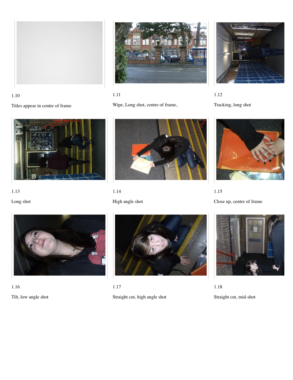
The use of a video camera, allowed to us to film to the best of our ability, using a variety of shots - such as mid-shots, close-ups and long shots. Camera movements aided us in showing continuity in our work and helped create verisimilitude for the audience. Examples of camera movements used frequently in our opening are tilts and pans. (CLIP) As a group we realised the importance of a trip-pod, as it allows our shots and camera movements to be steady and flow smoothly, creating verisimilitude and allow our final product to look professional.
To edit our opening, we used the software iMovie. This allowed us to edit and manipulate our work to the best quality it could be. To allow the music to flow with the shots on screen, we used the software to control where it begins and ends, however we found this quite difficult at first due to our original shots being quite short and fast. However, after re-filming certain sections, we found it easier to stop the music abruptly, creating the idea of a disruption in the opening. (CLIP) We also experimented with reversing a pan of the Geek putting up her hair. However, this manipulation flipped the words on a poster in the shot, which would have made it obvious that the shot had been altered, disrupting the verisimilitude on screen.

Preliminary Task:
The main thing we have learnt through the progression from our preliminary task to our final product is the use of sound. (CLIP) In our preliminary task, it is apparent that the background sounds keeps changing, disrupting the continuity and verisimilitude for the audience. In our final product, we tried to overcome this problem by filming after school, when the corridors and classrooms are empty. Even though we have overcome this issue a lot in our opening, there are still times when the background sound isn’t as quiet as we would have liked, but we feel that this doesn’t distract the audience or disrupt the continuity. When re-filming, we also noticed that the continuity was slightly disrupted by the use of having people in a classroom in the corner of a shot, compared to it previously being empty. However, we don’t feel that this wasn’t very distracting to the audience, as the main focus was still on Nina.
By filming our preliminary task, we found that the angle of which the scenes were shot affected the continuity of the piece. When filming our opening we shot certain scenes from a number of different perspectives, as this allowed us to select which shot was most appropriate and effective when showing continuity.
As a group, we felt that the lighting in our preliminary task wasn’t as effective as we would have liked it to be. (CLIP) Due to this when filming our opening we made sure that the corridors we were filming in were well lit and consistent, with the actors not standing in the shadows that were created by the windows.
Overall, we feel that we have produced a good opening for a teen romantic comedy, which mainly follows the codes and convention of the genre. Although there are some faults with the product – such as the background sound and people in the classroom – we feel that overall our opening is of good quality.


Wednesday, 9 February 2011

Rehearsal Schedule

Rehearsal Schedule:

Who: Anna and Charlotte and Robin

What: Read through of script/storyboard

Where: In common room

Time Dedicated: Period 5 (1 hour)

Number of Scripts Needed: 4 

Location Scouts

Where:
  •         School
  •         Character’s bedrooms

Why:
  •         School is a big part of teenage life and our audience feedback from our questionnaire told us that this setting is expected in a teen romantic comedy.
  •         The use of character’s bedroom helps set up the stereotype for the specific character and also this links to the idea that all teenagers live at home. 

Character Profiles

Character Profiles:
Name: Nina
Costume: Backpack, glasses, hair tied up, plain t-shirt, jeans
Characteristics: Shy, clever, introvert, brunette
Gesture/movements: Head down, fidgeting
Representations: Youth, geek stereotype

Possible Casting Idea:
Who: Anna Alcock
Why: Small in height, timid, has characteristics that match character profile

Character Profile:
Name: Leah
Costume: Black top, black skirt, black high heels, hair down, jewellery
Characteristics: Confident, blonde, high maintenance, attitude
Gesture/movements: Hands on hips, sharp movements
Representations: Youth, bitch stereotype, middle – upper class

Possible Casting Ideas:
Who: Charlotte Nettle
Why: Has characteristics that match character profile, blonde

Character Profile:
Name: Rob
Costume: White t-shirt, varsity jacket, jeans, short hair
Characteristics: Friendly, confident, brunette, affectionate
Gesture/movements: Fluid movements, eye contact
Representation: Youth, jock stereotype

Possible Casting Ideas:
Who: Robin Freemantle
Why: Has characteristics that match character profile, brunette, tall

Character Profiles:
Name: Jack
Costume: Band t-shirt, headphones, baggy jeans
Characteristics: Shy, bitter, lonely
Gesture/movements: Messy, expressionless
Representation: Youth, loner stereotype

Possible Casting Ideas:
Who: Chris Alcock
Why: Right type of look, has some characteristics that match the character profile
           

Geek Chic Storyboard


Geek Chic Script


Thursday, 27 January 2011

Synopsis of Film

A Geeky Girl joins the school and is taken in by the popular people.

There is a party and the popular girls give the Geeky Girl a makeover, and at the party the 'head' Bitch’s boyfriend falls for the Geeky Girl.

The 'head' Bitch then finds out and plans to make the geeky girl’s life hell. Lots of pranks happen to the Geeky Girl and she becomes friends with the Loner Guy, who the popular people bullied in the past. The Loner Guy and Geeky Girl and the Popular Girls all prank each other.

The film ends with a school dance and the Geeky Girl gives a meaningful speech about how looks aren’t everything. She is announced Prom Queen and the Popular Boy asks her out, but she realises she loves the Loner Guy.

The Popular Girls learn from their mistakes.

Wednesday, 26 January 2011

A Guide to Paramount Pictures


The production and distribution company that we have decided to work with is Paramount Pictures.

We have chosen this organisation because they are considered to be one of the top-grossing movie studios, another reason why this is a suitable company is because they have produced and shown many successful films of our genre (teen romantic comedies).

An example of a successful Paramount Pictures produced teen romantic comedy is Mean Girls. Other films that have been successfully produced by Paramount Pictures are Forrest Gump (1994), Transformers (2007) and Iron Man (2008).

All of the films we have mentioned are well known and the company has a good reputation within the industry, therefore this allows our film to have a good chance at having success.

Paramount is a vertically integrated organisation and the significance of this is that the majority of the money will go to one company meaning that they will gain more profit allowing us to do the same.

Examples of successful teen romantic comedies distributed by Paramount Pictures are Clueless (1995), Pretty in Pink (1986) and Angus, Thongs and Perfect Snogging (2008).

These films tie-in well with our genre, as they are all successful teen romantic comedies and are distributed by Paramount Pictures. 


220px-AngusThongsmovieposter.jpg   220px-Mean_Girls_movie.jpg  pretty-in-pink.jpg

Wednesday, 19 January 2011

Multi-media Presentation of Our Findings


                                                           Stock Settings: High School

Themes: School (fitting in)

Tuesday, 11 January 2011

She's The Man (Opening)

0:00-2:00
Distributor: DreamWorks
Sound:
Non-diegetic sound is the main type of sound that is heard in the opening of the film. The song is upbeat and fast which quickly establishes that the film is for teens. Diegetic sound is heard through dialogue but this only consists of screams when the brunette female character scores a goal. This emphasises that she is good at football which indicates to the audience that this could possibly be important to the narrative or her character.
Editing and Framing:
Straight cuts are used to follow the fast pace of the action, as well as creating verisimilitude. The brunette character is in the majority of shots, showing her to be either in the frame alone or surrounded by people. This gives the impression that she is the main character. Also, when close framing is used, the audience begin to identify the time of year that it is as the female characters are wearing bikinis and skirts, showing that it is summer.
Camera Shots and Movements:
Long shots are used frequently in the opening of the film, showing the setting to be a beach. This strongly suggests to the audience that it is summer, as well as giving an impression of the type of place the characters live. Tracking is used to follow the brunette character playing football. This reinforces the idea of her being the main character and important to the narrative. Close-ups are used throughout the opening, focusing on character’s legs and the football itself. This implies that football is very important to the narrative, as well as identifying that these characters are teenagers. Mid-shots are also used, an example of this is when the girls begin to dance with each other. This reinforces the stereotypical view that all teenagers just care about having fun, and also identifies the brunette female character to be quite outgoing and popular, as she is in the centre the dancing.
Mise en scene:
The costume the characters are wearing in the opening of the film reinforce that it is summertime, as all of the girls are wearing bikinis and the male characters are topless with shorts on. The brunette female character wears a bikini but covers her bottom half with a demin skirt. This shows her to be less feminine then some of the other girls as she isn’t showing as much flesh. This also highlights her to look physically different then the other girls, again reinforcing the idea that she is the main character of the film. High key lighting has been used to give a natural feel to the situation, as they are on a beach in the summer. This style of lighting also creates verisimilitude.
Titles:
The titles of the film are very artistic and colourful. This connotes that the film is youthful from the very beginning and possibly not very serious. The colour orange is used to highlight the different names that appear on screen. This colour isn’t gender specific, but is stereotypically associated as a more feminine colour, suggesting that the brunette female character has some masculine qualities. The font is a block simple style, but as the text is white, this has connotations of purity and innocence, which is a trait that is stereotypically associated with youth. The titles do not appear in one specific place on screen, possibly referring to the unpredictable lifestyles and personalities of teenagers. This random feel to the titles gives the impression to the viewer that the action taking place in the opening is going to be disrupted throughout the film, as it seems as if what is being portrayed is a perfect environment, but it is being invaded by text randomly.

Monday, 10 January 2011

She's All That (Opening)

0:00-1:50
Distributor: Miramax Films
Sound:
The film begins with non-diegetic sound through the use of music. The song is youthful and has a heavy beat, indicating that the female character may be quite serious, but the overall tone of the music immediately implies that this film is that serious and the main characters are probably going to be young teenagers. Diegetic sound is heard through dialogue in the opening. An example of this is when Laney goes to wake up her brother. The way she speaks to him shows she has authority and allows the audience to quickly wonder why she can speak to her sibling in a parental way.
Editing and Framing:
The action constantly fades in and out during the beginning of the film, allowing the audience to understand that time is passing but also show she is putting a lot of effort into her work. The frame during this time is also filled with her and her work, which gives the impression to the viewer that she takes her school work seriously and emphasises that art in particular is her specialty. This idea of being hard working and passionate about a subject isn’t the way that many teenagers are stereotypically portrayed, which immediately shows her to be different. When Laney talks to her brother, straight cuts are used to create verisimilitude and help the audience relate to her character easily and the situation she is in.
Camera Shots and Movements:
Mid-shots are used of Laney when she is trying to wake her brother up, showing her in the same clothes and her reactions to what he says. This allows the audience to see that she has just finished her work whilst everyone else slept, reinforcing the idea that she is hard working. The camera also tracks her as she walks towards his door, indicating to the viewer that she is an important part of the narrative. Close-ups are used to show Laney’s hands when she is working and the paint when she uses it. These all have connotations of being creative and strongly suggest she is an imaginative and artist character.
Mise en scene:
Laney wears a yellow top with brown sleeves and apron in the opening of the film. The apron she wears links with her painting but the odd mix of colours suggests that she is trying to express herself through her appearance, which is a stereotypical trait of teenagers. Also, she wears glasses which portray her to be a geek characters as glasses have connotations of being intelligent. When Laney is painting, the lighting is quite dark, indicating that what she is doing may be private as well as linking with her doing it in her basement where there wouldn’t much light realistically, so this style of lighting creates verisimilitude.
Titles:
The titles used in the film appear at the beginning of the film but do not show up on screen in one fixed place. The animation used in the titles link to what Laney is doing, which is painting. For example, one piece of text appears to be squished down and then stabled to the work. This reinforces the idea that art is an important part of the narrative and highlights Laney to be an important character as she is the one making the piece. The font and colour used look like paint and again links to what is happening on screen, allowing the audience to not become distracted by too many colours.

Clueless (Opening)

0:00-2:00
Distributor: Paramount Pictures
Sound:
The first sound heard in the opening of the film is non-diegetic. The music used here is a popular song called ‘Kids in America’. This immediately indicates that the characters are teenagers and the setting is America. Non-diegetic sound is also heard through the use of a voiceover. This allows the audience to feel as if they are seeing into somebody’s life and the voiceover also makes the character have a personal connection with the viewer. Diegetic sound is heard through the use of dialogue. The audience get in impression of the type of character that teenage girl is as she calls her father ‘Daddy’, which is a stereotypical way of portraying a character to be spoilt.
Editing and Framing:
Straight cuts are use throughout the opening, immediately creating verisimilitude, as well as keeping a fast pace to the action, connoting that a lot happen in these character’s lives. In many shots the frame is full of people having fun and laughing by the pool or joking at the bar. This gives the impression that it is summer time and indicates that this group of people are friends. Also, the blonde female character is in the majority of the shots, which quickly gives the impression to the audience that she is will be important to the narrative, and is probably the main character.
Camera Shots and Movements:
Mid-shots are used frequently throughout the opening, an example of a mid-shot is when the female blande character walks out of a shop carrying shopping bags. This indicates to the audience that she is possibly a materialistic character as well as being very wealthy. The camera then tracks the character as she walks off with her shopping bags. This gives the impression to the viewer that this character is going to be important as the camera follows her. Close-ups are also used in the opening, for example when the group of girls are at the bar. This shot shows one of the girl’s legs on show as she is wearing a very short skirt. This reinforces the stereotype that young girls are provocative and want attention. A crane movement is used when the jeep is shown. This allows the audience to see the group of girls in the car and shows that these characters will more than likely been seen numerous times throughout the film.
Mise en scene:
When the girls are around the pool, they are all wearing bikinis and swimming costume, reinforcing the idea that it is summer. This also shows them to be revealing quite a lot of their bodies, implying that they take care of their appearances, which is a stereotypical teenage issue. The blonde female character’s costume when at home is quite formal and covers the top half of her body. This gives the impression to the viewer that she is a different type of person when with her parents, which is a common thing that many teenagers do, and this helps the audience relate to her character. This yellow tweed skirt and blazer, has connotations of her being popular as she would be noticed in a crowd and again emphasises that it is summer as yellow is often associated with this season. The lighting used is very bright in the scenes outside, as it is summer. High key lighting is also used to create a realistic feel to the film and allow the audience to relate to the characters and issues more easily.
Titles:
The titles of the film begin immediately after the Paramount Pictures logo is seen. The titles themselves are very bright but it could be argued that the colours don’t match, which echoes the stereotype that young people try and express themselves through colour but they’re not always perfect. The font used is large and in block, but the letters aren’t all the same sizes, which again reinforces the idea that teenagers aren’t always perfect. The text appears in the centre of the screen, but only the distributor and name of the film are shown in the opening. This gets the audience’s attention straight away but doesn’t allow them to be distracted in the rest of the opening.

Sunday, 9 January 2011

Angus, Thongs and Perfect Snogging (Opening)

0:00-1:55
Distributor: Paramount Pictures
Sound:
The majority of sound heard in the opening is diegetic. However, non-diegetic sound can be heard in the opening, through the use of instrumental music. The light music is relatively quiet, enabling the audience to hear and focus on the dialogue between the daughter and her father. The diegetic sound in the opening of the film is heard through dialogue. The stereotypical way that many teen romantic comedies portray young people to speak in slang and differently to adults is echoed here. The line ‘Boys don’t like girls for funniness’ reinforces the stereotype that young girls a constantly looking for approval from boys, which allows the audience to relate to the characters.
Editing and Framing:
Straight cuts are used throughout the opening, which creates verisimilitude. This also shows characters interacting, such as the father and daughter talking. When Georgia walks into the room, the frame is filled with shocked expressions from the other characters at the party. The use of this immediately creates comedy as she has come dressed differently to the other characters at the party. It also gives the impression that she is not like the rest of the teenage characters as she seems more quirky.
Camera Shots and Movements:
Tracking is used to follow the car as the Georgia’s father talks to her as she walks down the street. This immediately implies that she is going to be important to the narrative because she is creating an issue from the very beginning of the film. Mid-shots are used to show Georgia’s friends telling her why they didn’t dress the same as her to the party. This emphasises how different she is to the rest of the people at the party as the audience can see what the other characters are wearing. A close-up of Georgia’s face is also used in the opening when she walks into the room of people. This shows her looking disheartened that she is dressed so differently and also shows her to seem self-conscious, which aids the viewer in relating to her character.
Mise en scene:
The costumes that are seen in the opening are fancy dress, but still give an insight into the types of characters in the film. For example, Georgia is wearing an olive compared to the other girls who are dressed as angels and bunnies. This connotes her to be quirky and someone who doesn’t follow the crowd. One girl is immediately portrayed as being a bitchy character, as she teases Georgia on her outfit. This girl is dressed as a black cat, which has connotations of being bad luck and evil, giving the impression that she could be a villain in the narrative. Georgia’s friends are all dressed like many other people at the party, showing them to go along with the crowd and being self conscious about what other people think about them, which is a stereotypical teenage trait. High key lighting is used to create a natural feel to the film, allowing the audience to believe the characters and situations are real, and therefore relating to them easily.
Titles:
The titles appear at the bottom of the frame, which allows the audience to not be distracted by what is happening on screen. Also the font is curly and could be considered childlike, which gives the impression that the characters aren’t very serious. The font is white, which again doesn’t distract the viewer, but links to the idea of innocence, which is frequently associated with children.

10 Things I Hate About You (Opening)

0:00-1:50
Distributor: Touchstone Pictures
Sound:
Non-diegetic sound is heard from the very beginning of the film, when the Touchstone logo is seen. This immediately addresses that the target audience are teenagers, as the music heard is an upbeat song which the young girls in the blue car recognise and dance to, showing that it is popular amongst this age group. Another non-diegetic song is used when the camera pans to another car that is also waiting at the same crossing as the blue car. The song heard here is ‘Bad Reputation’, which implies that this girl is different to the other characters, which is emphasised by their judging faces.
Editing and Framing:
Straight cuts are used throughout the opening, creating a sense of verisimilitude. They have also been used to show the difference between the girls in the blue car and the girl in the red car. This helps emphasise how different the female character in the red car is and gives a sense of her being an outcast as she is on her own. The style of framing used in this scene also implies the girl in the red car is a loner, as nearly half of the frame is taken up by the empty seats of the car, compared to the framing of the blue car being full with characters.
Camera Shots and Movements:
Mid-shots are used to show the reactions of the group of girls in the blue car when the female character in the red car pulls up alongside them. This again reinforces the idea that she has a reputation for being different as they all seem appalled that she is so close to them. Another example of a mid-shot used is when the red car owner pulls down the prom poster at school. This is unusual to see a teenage girl do, as many young girls are stereotypically represented as dreaming about the prom since being a child. Tracking is used before she tears down the poster, which gives the impression that she is going to be an important part of the narrative. A long shot is used to show the city that the film is set in and gives the audience a location of the characters which allows them to relate easier. A pan is used to reveal a more suburban area in the city that the characters live in, allowing the audience to automatically have expectations of the types of characters they will see. Another setting is shown through the use of a tilt. This camera movement reveals a school, which is a stereotypical setting that is used frequently in teen romantic comedies.
Mise en scene:
A contrast of the characters is shown through costume in the opening of the film. The girls in the blue car are all wearing light colours, with the driver wearing a flowery top. This connotes them to be feminine and free, which is representative of their age and stereotypical of teenage female characters. However, the girl in the red car is wearing a black cardigan with a dark top. This has connotations of her being close-off and mysterious, which again shows her to be an outsider to the rest of the characters. High key lighting is used to give a natural and realistic feel to the film, which also helps the audience believe the characters are real people.
Titles:
The titles begin from the very beginning of the film, and are first seen against a black screen. This highlights the bright colours of green and blue used in the text seen, which immediately gives a less serious feel to the opening. The font is also very rough looking and could also be implied to be handwritten, which links to the teen genre and target audience. When the screen begins to show footage of the city and the school, the titles appear in the middle of the screen, in the same blue and green colours. This keeps a theme throughout the opening. When action is taking place, such as the car scene, the titles do not appear on screen. This allows the audience to not get distracted and instead focuses the attention on what is happening in the scene.

Friday, 7 January 2011

Textual Analysis: She's All That

Distributor: Miramax Films
Typical Codes and Conventions:
She’s All That is set in America. The main setting used in the film is a high school, this is a very common stock setting that is used in the majority of teen romantic comedies, as it highlights the idea that school takes up most of a young person’s life. Some scenes show individual character’s homes, such as Laney and Zack. The use of these in the film reinforces the stereotype that all teenagers live with their families and are financially dependent on their parents. The local beach is also seen at various times throughout the film. It is shown as a meeting place for the teenagers where they can hang out in the day and also gives a more specific idea of the type of place the characters live.
Laney’s costume changes throughout the film. This use of mise en scene visually shows the change in her personality and character. When she is first seen, she wears glasses and a mismatch of colours. The glasses portray her to be a geek and that she doesn’t fit in with the other perfect looking characters. Also, the use of many different colours being worn at once has connotations of her trying to express herself which is a stereotypical view of teenagers. As she begins to change in the film and open up more as a character, her costume changes too. She begins to wear dresses instead of trousers, showing her to be more feminine now and taking care of her appearance like the other female characters. Also she doesn’t wear her glasses anymore, which connotes her to be more accepted as she physically looks similar to the other characters in the film. Zack is immediately portrayed as a jock by him wearing a letterman jacket when he is first introduced. Throughout the film, Zack tends to wear simple clothing such as t-shirts and jumpers. This echoes the style of many teenage boys so it is a stereotypical style of costume that is seen in teen romantic comedies.
Stereotypical teenage traits are seen throughout the film, an example of this is Taylor getting a tattoo. This encodes her to be rebellious, which is a stereotypical view of teenagers. Prom Queen posters are also seen scattered around the school on walls. This emphasises the important of the prom to the narrative as well as showing the dance is considered very important to many teenagers.
Non-diegetic music is used at the very beginning of the film. This interests the audience straight away and also establishes that it is a teen film as the song is popular and upbeat. Diegetic sound is heard through dialogue. Many of the characters swear when speaking to one another which reinforces the stereotypical view that all teenagers use bad language.
High key lighting is used constantly throughout the film, which gives a natural and realistic feel to the situations and narrative, and also creates verisimilitude.
Narrative Structure:
She’s All That follows a linear narrative, consisting of a very clear beginning, middle and end. The film also follows Todorov’s theory:
Equilibrium: Zack returns to school after Spring Break.
Disruption: Taylor breaks up with Zack.
Recognition of Disruption: Taylor starts dating another man.
Attempt to Repair Disruption: Dean bets Zack that he couldn’t make Laney Prom Queen.
Disruption: Zack begins to like Laney.
Recognition of Disruption: Zack opens up to Laney.
Attempt to Repair Disruption: Zack and Laney nearly kiss.
Disruption: Laney finds out about the bet.
Recognition of Disruption: Laney ignores Zack’s phone calls.
Attempt to Repair Disruption: Laney goes to prom with Dean instead of Zack.
Disruption: Dean tries to have sex with Laney.
Recognition of Disruption: Laney goes home instead.
Attempt to Repair Disruption: Zack is waiting at Laney’s house and they kiss.
Reinstatement of Equilibrium: Zack and Laney graduate and are now together.
Characters:
The characters in She’s All That are very stereotypical of a teen romantic comedy. Mise en scene reinforces these stereotypes throughout the film. For example, Taylor is portrayed as the bitch, as she ruins Laney’s dress and also tells her she’s not good enough to be around her and her friends. Another stereotype seen in the film is that artistic people have dark personalities. An example of this is Laney’s art class peer, who wears very dark clothes throughout the film and makes jokes that Laney should kill herself.
Propp’s theory can be applied to the characters in the film. Zack is portrayed as the hero, because he tried to save Laney when he thinks Dean has taken her to a hotel to have sex with her, and he also drives the narrative forward. Laney is shown to be the Princess, as she is Zack’s reward after he tells the truth about his feelings and that he was in the wrong for making the bet. As the hero is a male in the film and the Princess a female, this implies it is very traditional when it comes to the character types seen in the film, which may be due to when it was made. The villains in the film are Taylor and Dean, as both try to stop Zack and Laney getting together, such as Dean going to prom with Laney and Taylor trying to win Zack back. Laney’s friend and Zack’s sister are the mentors of the film, as they help Zack and Laney be together by telling Zack about Dean’s plan.

Themes:
An important theme throughout She’s All That is family. This emphasises the stereotype that teenagers are dependent on their families and also shows how important Laney’s family is to her. The idea of not fitting in is also a strong theme seen in the film. This is also a very important part of the narrative and seen as an important part of teenage life.
Technical Aspects:
Mid-shots are used continually throughout the film, allowing the audience to see character’s reactions, whilst also showing other character’s at the same time. An example of this is when Zack is announced Prom King.
Close-ups are used frequently in the film, often to show reactions and emotions of characters. For example, when Laney finds out about the bet. This helps the audience identify easily with the character as they can clearly see how they are feeling.
Straight cuts are used consistently throughout the film as it creates verisimilitude and continuity, making the audience believe what is happening to the characters is real, and therefore identifying with them and the situations and issues they are facing.